
Before you even start reading, you need to understand one thing: the real test for a logo isn't whether you "like it". It's whether or not it survives contact in the real world.
That means prioritizing the "unsexy" things that make a logo truly work for you.
When I look at practice logos, regardless of specialty, I check for these 3 things before even thinking about a color palette.
1) It has to be legible
When it comes to logos, the more detail you add, less it works for you. If you want it to read clearly, it needs to err on the side of simple.
Thin lines might work on a 27 inch monitor, but turns into a smudge in an instagram profile circle. And forget about embroidered scrubs or a sign from 20 yards away.
You don't need a literal symbol to communicate what you do, either. An ophthalmologist does not need an eye in the logo. Patients can read and most don't stumble into a specialists office. The just want to know they found the right place.
In most cases, a clean wordmark does more work than an icon trying to explain the specialty.
Your logo needs to be legible before it needs to be clever.
2) It has to work in any space or orientation
You don't always get to decide when and where you logo will show up. Think of fax orders, website headers, social media profiles, sponsorship placements, referral pads, signage etc. If you don't have several orientations that look good in several places, you're only half prepared.
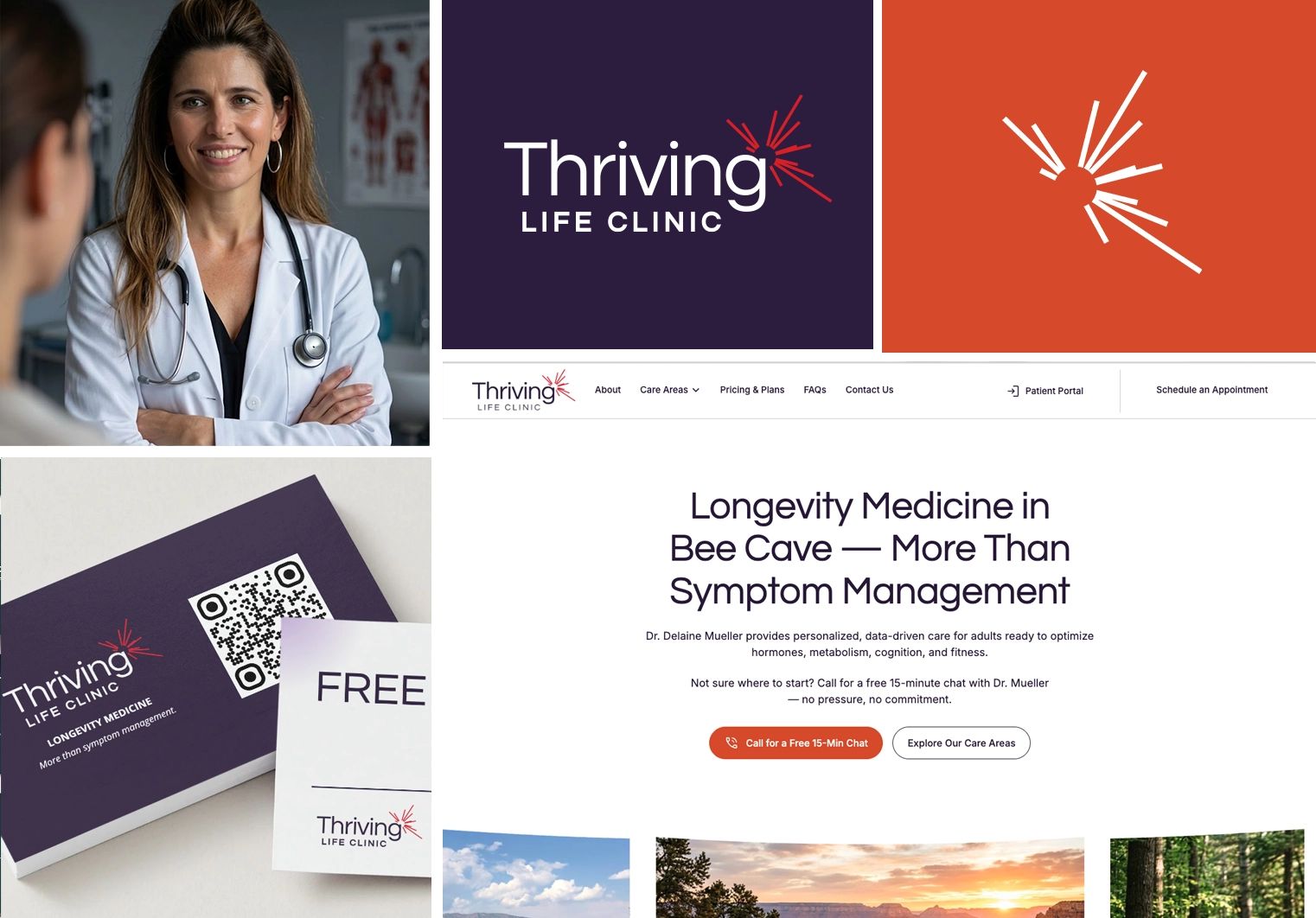
A finished logo isn't one version, it's a small system. A horizontal version for wide spaces. A stacked or square version for anything closer to a square. An icon only mark for spaces too small for the full name to fit.
If your designer only handed you one file, you don't have a finished logo yet. You have a piece of one.
3) It has to hold up in black and white
Color is the first thing to disappear. Think of engraved signage, laser etched plaques, single color print runs, and fax forms. If your relying on a specific colors to make "make it pop", it breaks the moment it need to show up without its' special color.
Federal accessibility standards for building signage require a measurable level of contrast between characters and their background, specifically so patients with low vision can read exam room and directional signs. That's a legal requirement, not a design opinion. It's a built in check for the black and white test: whether a shape holds up in pure light and dark.

Contrast is the (legal) requirement.
Try it yourself: convert your logo to solid black and white, no gray. If it still reads clearly, you're fine.
What this means for your practice
Before you approve a new logo, or decide whether the one you already have is actually working, run it through these three tests. Shrink it down. Try it in a few different shapes. Strip the color. If it passes, great. If it doesn't, you may just be halfway there.
Remember: a logo is not your whole strategy. I see a lot of clients stress because they want it to communicate everything they do. As if the right design could do the job of the website, reviews, and reputation.
That's a lot of pressure to put on a few letters.
A logo is one piece. It matters, but it was never going to carry your practice on its own.
If you are curious about fractional marketing services, branding workshops, or starting a new practice and need guidance, we'd love to talk to you. Book a 20-minute intro call here to see if we can help.